Karoshi are proud to have been awarded a Certificate of Excellence at the 2014 International Typographic Awards.
The annual awards are organised and judged by the prestigious International Society of Typographic Designers (ISTD) and were hosted at the De La Warr Pavillion, Bexhill on Sea.
Our award came in the integrated designs/campaigns category in recognition of our Brazil Fourteen project.
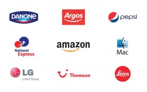
Ever noticed how many logos appear to be smiling at you? It has been said that there are around 50 types of smiles that humans use, most of which can be understood immediately. This could be one of the reasons why so many designers have adopted it as a device. In much the same way as you would select that one particular ‘emoji’ out of the range of 18 simple smiley yellow faces, the clever use of a curved line or shape can appear to tell the viewer a very particular message.
Many of these examples integrate a hidden message along with this device, such as ‘Amazon’ using its smile to show they sell everything from A to Z and ‘National Express’ taking you from one location to the next. Although, it is through an example like ‘Argos’ that a smile is symbolized for the clear purpose of conveying a particular emotion and value. With its smile stretching the full length of the logotype, it gives a welcoming, friendly tone coupled with a confident perception from it’s controlled curvature.
Above all, the smile’s ability to be understood universally is what makes the device so useful. It is unlikely that smiling at someone in a different country would give the undesired reaction. In general everyone likes and wants to feel happy so a brand who can suggest they will make their customers smile is an attribute that would clearly explain its popularity.
20 years ago this week at Memphis International Airport an MD-11 jet emblazoned with the new FedEx logo was revealed to the world. Widely recognised as a branding masterpiece, the mark’s visual simplicity and wit has ensured that it is as relevant today as it was in 1994.
Designed by Landor Associates San Francisco, a team led by Senior Design Director Lindon Leader had been tasked with better communicating the global reach of courier Federal Express. Their solution was an abbreviated wordmark finely crafted to reinforce the brand drivers of speed and precision alongside a new promise of ‘Delivering the World on Time’.
Ask most non-designers to look at the logo closely—as I often do—and they invariably double take before discovering the gift concealed within the negative space. For us it’s this restraint of concept that means the idea has endured for so long.
As Leader himself stated: “There’s nothing really compelling about an arrow, it’s overused and rather mundane. The power of the hidden arrow is simply that it is a hidden bonus. Importantly, not ‘getting the punch line’ by not seeing the arrow, does not reduce the impact of the logo’s essential communication. On the other hand, if you do see the arrow, or someone points it out to you, you won’t forget it.”
Implicit, not necessarily explicit.
An expanded story of the brand development can be read on Fast Co and CDF. There’s also an interesting review of the Arabic version of the wordmark by The Logo Smith.