Thoughtfully tailored
Services provided
— Brand identity
— Brand strategy
— Print design
— Digital design
Context
How do you capture the progressive and disruptive proposition of a new creative agency and forge a dynamic identity inspired by the company’s name? The Silk Factory delivers cross-platform AV and digital creative for the entertainment industry. As a new agency established by experienced founders, it was important to convey a clear sense of the creativity that drives its client work.
Idea & difference
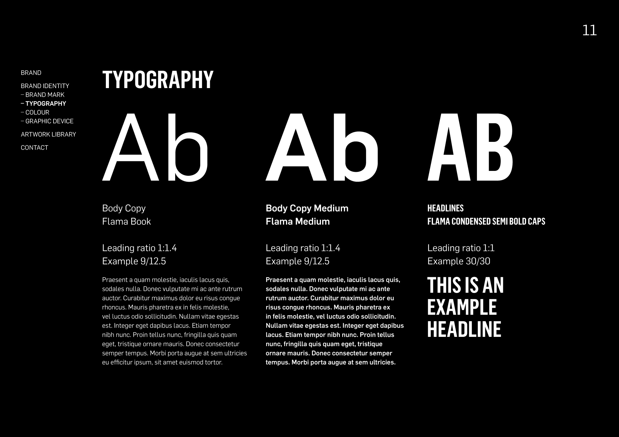
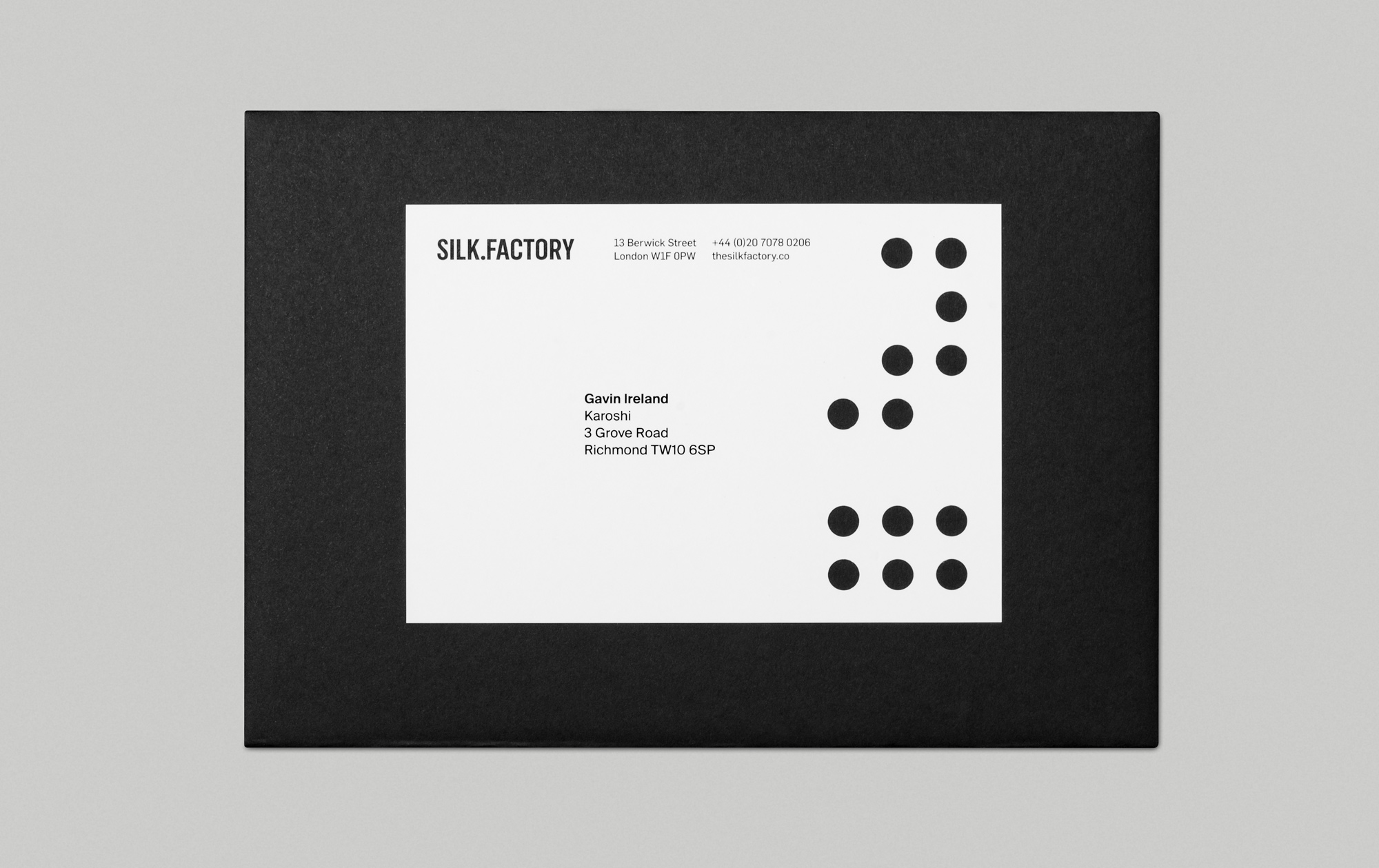
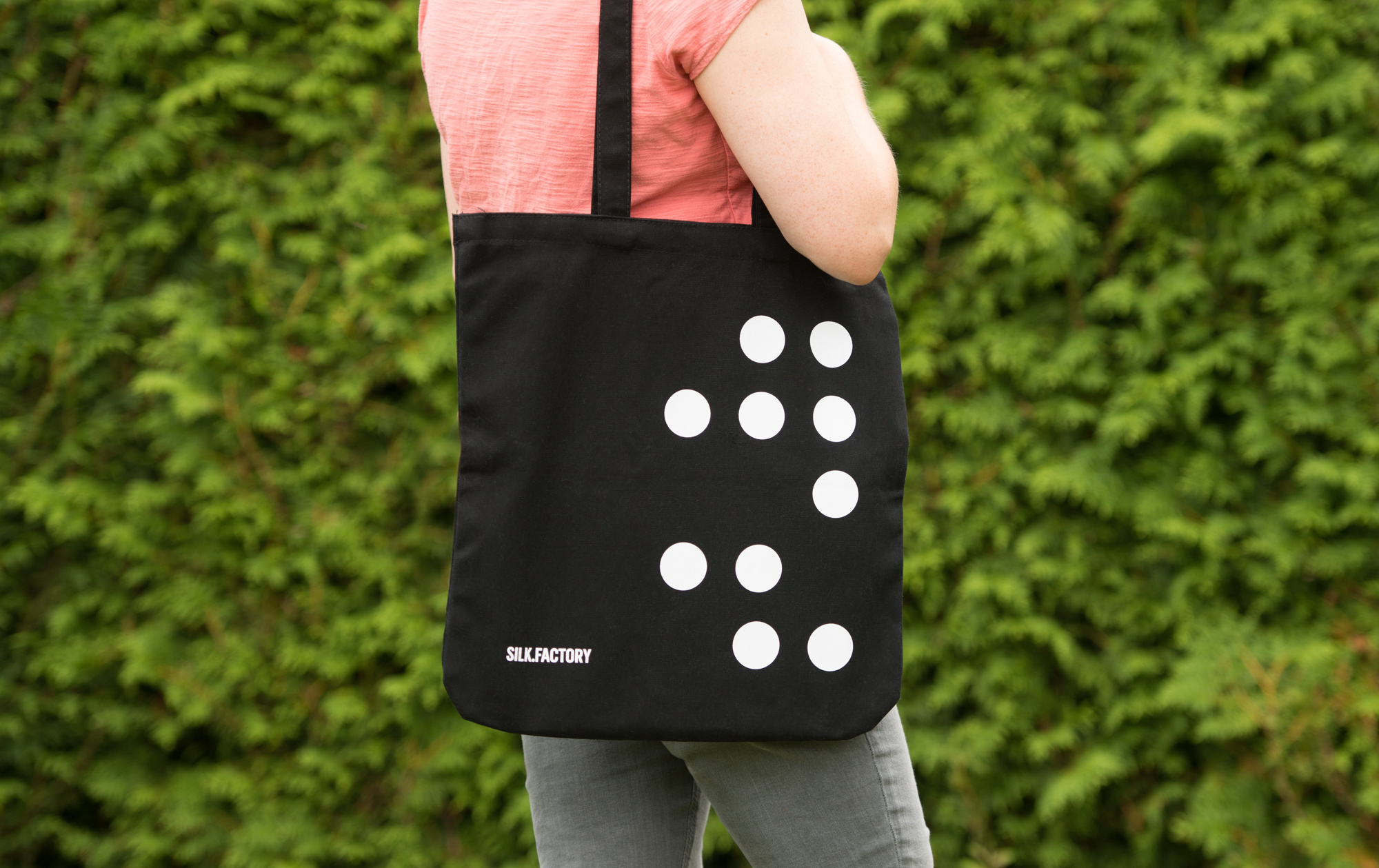
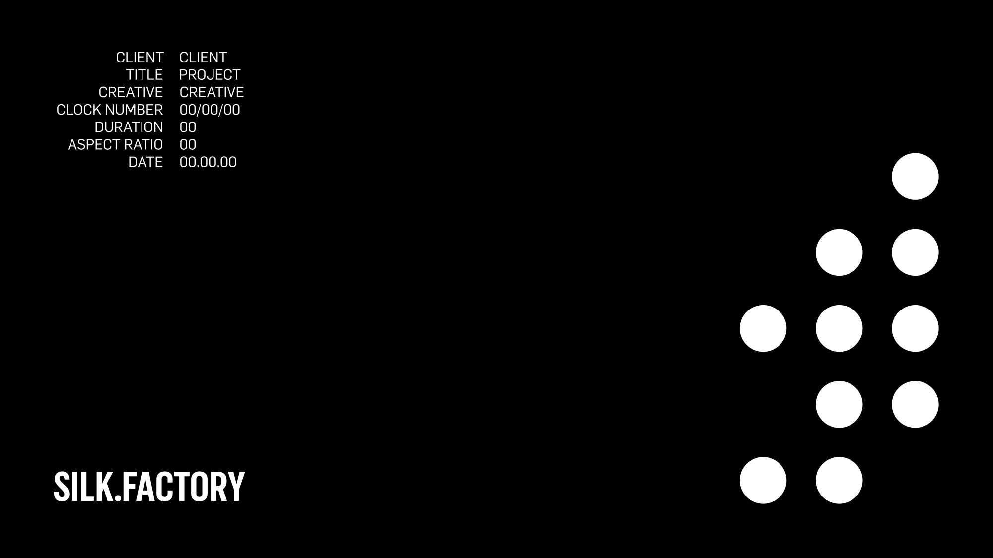
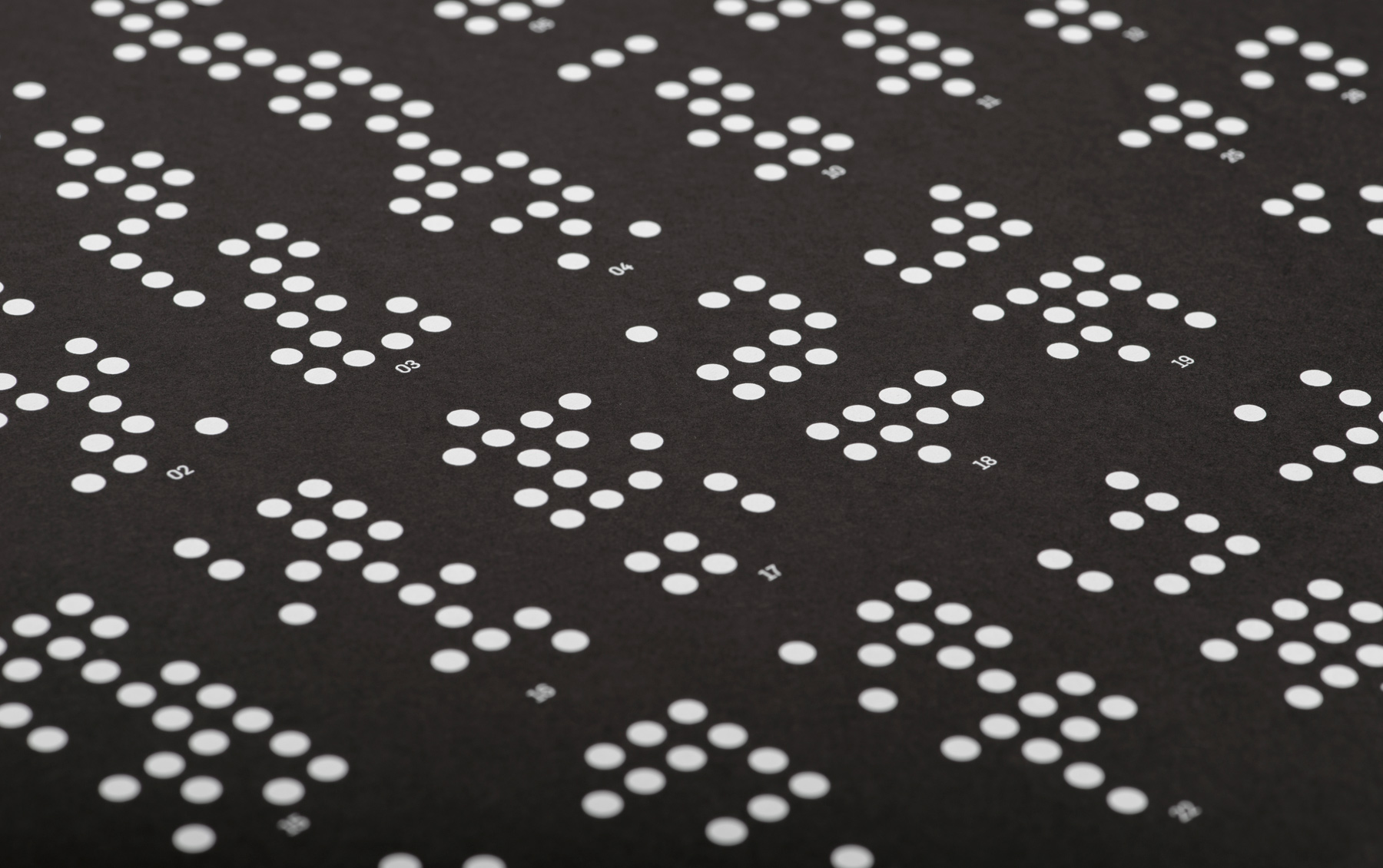
The Silk Factory takes its name from the former use of its building in the old textile district of Soho. We developed an identity system inspired by the punch cards used by the Jacquard loom, a pioneering device invented in the early nineteenth century to produce highly complex silk designs. At the heart of the identity lies a bold and versatile graphic language that has a naturally cinematic feel. We paired this with a bespoke, sans-serif word mark and minimalist, monochromatic colour palette, which was applied across print, digital and interiors. We extended the punched pattern into the print production with each business card featuring a unique configuration of laser-cut holes. The mailing labels were die-cut and paired with Ebony Colorplan envelopes.
“When we began our journey with Karoshi we knew only one thing – we needed a brand that communicated the values and principles of our new company. One which reflected the freshness and different thinking that was our foundation. With Karoshi’s creative skill and guidance we have been left with something very special indeed. We are proud of our new brand and the story it tells.” Andrew Snook, Silk Factory, Director of Production & Founder.