Warner Communications was established in 1972 when parent Kinney National Company spun off its non-entertainment operations and changed its name. Named after its most successful holding – Warner Brothers – it became the parent for the company’s interests in music publishing, motion picture and television film production, cable television, and magazine and book publishing.
Saul Bass & Associates were engaged to create a coherent and monolithic identity solution that was adopted by Warner Communications and all its divisions. After 50 years, even Warner Brothers dropped their iconic shield and replaced it with the newly developed mark. At the heart of the identity system lay the stylised ‘W’ symbol. Also known as the Big or Circle W, or even The Worms, it is a bold and captivating mark that I feel has all the essential attributes of a truly great logo. It is simplistic, but that simplicity is its strength, and it is accompanied by its huge personality. It has authority, but is also accessible and reassuring, and its subtle electronic essence perfectly captured the communications focus of the organisation.
My first encounter with the logo was as a child and I have a distinct, albeit slightly fuzzy, memory of its appearance at the start of the Ted Post movie, Magnum Force (parental controls in the early 80s weren’t quite what they are today). In its bold, red, white and black palette, the logo’s suitably minimalistic manifestation integrates perfectly with the film’s opening score, courtesy of the great Lalo Schifrin.
In 1984, with the release of Joe Dante’s Gremlins, Warner Brothers reintroduced an evolved shield logo and dropped the Big W. Then in 1990 Warner Communications merged with Time Inc. and Time Warner was born sporting a new identity courtesy of Chermayeff & Geismar. Time Warner subsequently spun off the Warner Music Group, which still retains the Saul Bass logo today.
It was to my complete surprise and obvious delight to find the Big W resurrected in 2012 in the titles of both Steven Soderbergh’s Magic Mike and Ben Affleck’sArgo. James Rocchi’s interview with Steven Soderbergh provides an insight into the arduous process he went through to secure its inclusion. God bless you Steven!
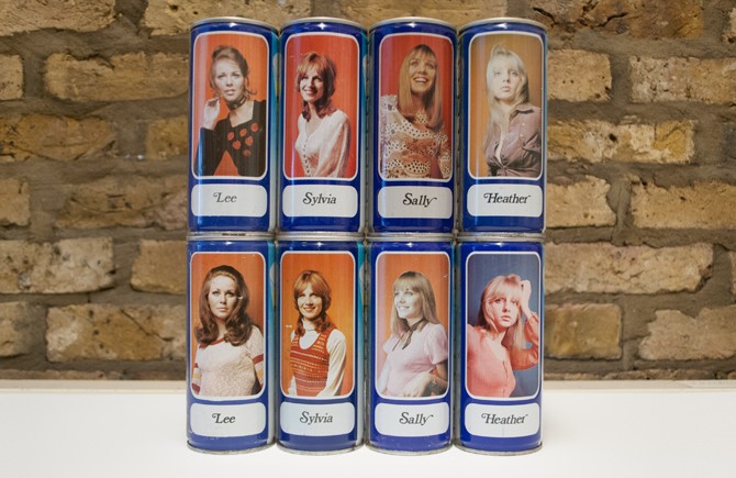
The empty lager cans which sit on one of the shelves in our studio are always a talking point amongst visitors, but not for the reasons you may imagine. Produced by Tennents Caledonian Breweries in 1972, the cans feature the third series of what were known as the Lager Lovelies, an iconic packaging approach which lasted for more than 20 years.
Although the canned beer market in Britain only really emerged in the mid 1950s, by 1957 there were more than 30 different brands competing for market share. This saturated marketplace prompted Scottish Brewers, Tennents, to radically rethink their can design. Their ubiquitous and enduring ‘two glass’ illustration which remained practically unchanged for 30 years and provided a literal representation of the cans content, only covered two-thirds of the cans surface. Having originally explored the idea of selling the remaining space to manufacturers of products which were purchased to accompany beer – nuts, crisps, cigarettes etc – this was abandoned for administrative reasons.
In 1959 Tennents began experimenting with photographic imagery when they launched their first Scottish series, featuring iconic Scottish landmarks. With the photography changing every 12–15 months, eighty different scenes were featured over a three year period, practically exhausting the Scottish Tourist Board image library. Perhaps influenced by the success of the Milk Marketing Boards advertising campaign featuring model Zöe Newton, in 1965 Tennents launched their first series of designs exclusively featuring model Ann Johansen. So phenomenal was the response to the new packaging, that from 1965–1969, Ann featured on every can of lager and export ale produced by Tennents. When Ann retired from modelling after a third series, Tennents – understandably nervous at replacing someone who had become synonymous with the brand – opted instead for a series of different models and in 1969 the Lager Lovelies were born. They were to have a particularly enduring reign and over the next twenty two years, 12 different series of Lovelies adorned the cans until their demise in 1991.
My thanks to Charles Schofield and Antony Kamm who’s book Lager Lovelies provided the background to this article.
New year, new recruit, new website. We are only just three weeks into 2014 and it has been an eventful year already.
Firstly, we welcome aboard Jacqui Browne, the latest recruit to our design team. Jacqui is a recent graduate of UCA Farnham who impressed during her internship last year.
Our updated website aims to improve the user experience across all devices. There’s greater insight into our approach and creative process plus a number of new case studies. We’ve also introduced this journal which we’ll keep updated with those creative pearls that are worthy of sharing.
To keep up to date with the studio in the meantime please follow us on Twitter.