Owning colour
Colour is a vital element that needs strong consideration when building a visual identity. If applied consistently and effectively it can instantly assist consumers in their recognition of a company or product. Arguably more powerful than a logo when used correctly (think EasyJet), the decision towards chosen brand colours is often made against competitors as a means of greater stand out in a given sector.
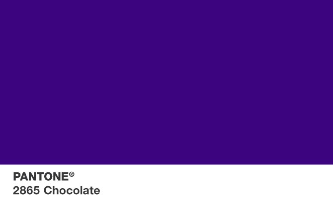
The importance for clear differentiation has inevitably led to the search for trademark protection – probably the best-known recent example being Cadbury. Although they may have lost their legal battle against Darrell Lea, they won the war and now have protection against competitors using Pantone 2865 (purple) for chocolate packaging.
Tiffany & Co have a trademark against ‘Robin’s Egg Blue’ for jewellery boxes and bags, and UPS have ‘Pullman Brown’ for parcel delivery but they’re only enforceable within a defined sector. Trademarking therefore does not enable you to truly ‘own’ a colour, but being able to ‘own’ consumers’ associations between a colour and product or service is undeniably more valuable.
Share